
Previous article
Emotion – Our Angular Library

It was the beginning of January 2017 when we started planning / building a new version for our software, with brand new codebase from scratch, and updated technologies.
We decided to use Angular2, TypeScript & SCSS as our Front-End technologies.
Right from the beginning, we started creating Angular components for our UI Kit, starting with buttons, inputs, typo, grid and these fundamental UI components.
But, as the product was growing bigger, the challenges were growing bigger too, and keeping consistency between visual components would just become harder.
What did we do?
We decided to build our own Front-End library, inspired on Material2 architecture since we were using Angular, which would allow us to custom design our components based on our needs and requirements. Hence, Emotion was born.
Our Design team wrote Usage Guidelines, which would contain a set of rules on how to use particular UI elements, such as buttons, modals or forms, along by designing a whole set of components, which by now have created our own IBC design system.
In Emotion, initially, we added those components we had designs for, starting from UI oriented, to extended functionality ones.
We then kept adding more components, which also included API Calls to our services, which would help us better maintain and reuse Front-End components, user or team service related.
Later on, since we were planing to publish our library as open-source at some point, we decided to separate these service / API related components into another library called Emotion Cloud.
This makes Emotion an independent Celonis library, which other people can use in the future for their own projects.
How did we do it?
Components
We build our components, based on Atomic Design structure, using SCSS for our styles and Angular/TypeScript for the Front-End. An overview of how our components are divided.
Atoms
Such as buttons, forms, modals, lists, tables, tooltips and more.
Molecules
Such as item choosers, dialogs, prompts, tag inputs, local data source and more.
Layouts
Page layouts, such as main layout, burger content. Content layouts, such as panels, sections, expandable panels and more.
Organisms
Larger components, which use atoms or molecules, such as placeholders and more. This structure helped us group components, in such a way that whenever new team-mates would join, they would easily get on-boarded and would have an idea of what to expect and where to expect that. As a matter of fact turned out to be a good turnout.
Styles
For our styling, we use SCSS as a CSS post-processor. Our SCSS architecture is divided into the following parts:
Shared CSS
Consisting of general styles, such as normalizers, typography, grid, helpers and different utilities that we wanted to easily have it accessible everywhere.
    // Utilities
@import "../styles/utilities/all_utilities";
// Partials
@import "../styles/partials/normalize";
@import "../styles/partials/grid";
@import "../styles/partials/overlay";
...
Main styles
Main styles define global variables, mixins, and functions, which contain our design & style global configuration system, such as units, breakpoints, sizes or colors.
Our main.scss file looks like as following:
    @import "variables";
@import "functions/string"
@import "mixins/animations";
@import "mixins/typography";
@import "mixins/overlay";
@import "mixins/grid";
...
As a result, we don’t generate any actual CSS in the end, but we only use this file to have access to our global configuration.
Component-based CSS
Since Angular allows and recommends this, every component-based style is included and encapsulated within its parent component, which affects the overall performance by having that style loaded only when using that component.
How did Emotion help us?
Having Emotion part of Celonis, helped us build many different Apps, by keeping the same Layouts, same design language & spirit and easily reusing components, which allowed us and different teams to tackle the user interfaces easily and relatively faster.
One of the greatest thing this library offered, was that idea of using it without having HTML & CSS superpowers, rather by having most of the layouting served and easy to use.
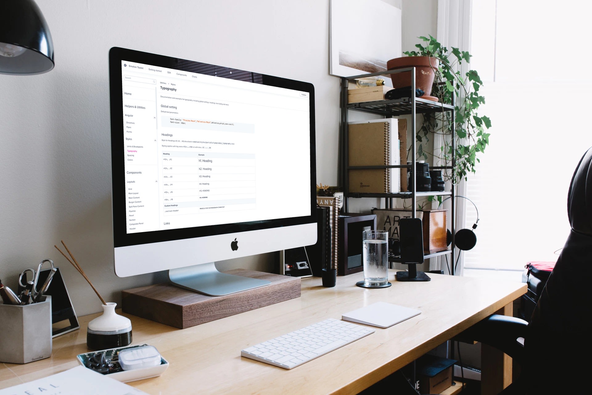
Along Emotion, we also build Emotion Demo, which was the place containing all the necessary documentation, API, usage examples & snippets where all developers in Celonis could access it and build their User-Interfaces easier.
We still continue to maintain and update Emotion by adding new components, and by improving/extending the existing ones.
The IBC is growing, and so is Emotion every day now.
